Components
It's often a good idea to split our UI into reusable parts, known as 'components'. Let's learn how you can create these with Fusion.
What are Components?
When we think about UIs as humans, we typically think of them in terms of reusable 'blocks' of UI. For example, you may divide up the following interface into these 'blocks':
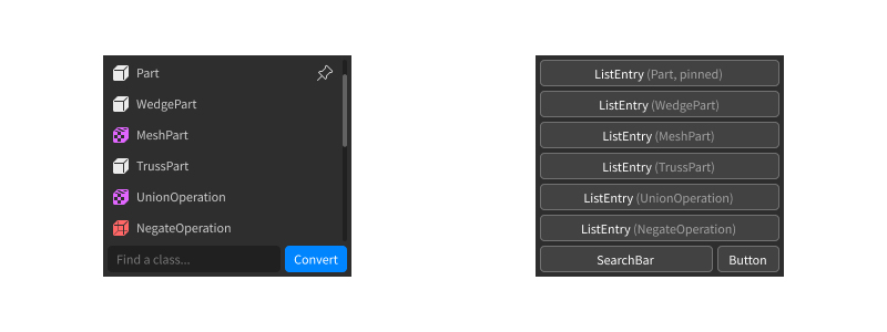
In UI design and development, these are widely known as 'components'.
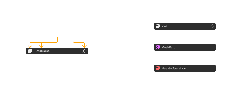
Components are useful, because we only need to define what each component looks like generally. We can then apply that look to every component across our UI. You can even provide properties, like some text to insert, or whether to show an icon:
Building our UI by assembling components (rather than creating every instance manually) will help us to reuse and organise our UI code, and makes it easier to read and edit.
Reusing UI
When we want to reuse a bit of code, we often put it in a function. We can then use that code snippet in multiple places, optionally providing arguments to tweak how it runs.
This lines up with what we need 'components' to do - we want to be able to reuse parts of our UI in multiple places, optionally providing properties to tweak how it looks.
That's why, in Fusion, components are just functions. They take in a table of properties, create some UI, and return it:
local function Greeting(props)
    return New "TextLabel" {
        BackgroundColor3 = Color3.new(1, 1, 0),
        TextColor3 = Color3.new(0, 0, 1),
        Size = UDim2.fromOffset(200, 50),
        Text = props.Message
    }
end
We can now call the Greeting function to get a copy of that UI with any
message we'd like:
local greeting1 = Greeting {
    Message = "Hello!"
}

local greeting2 = Greeting {
    Message = "Hey :)"
}
Note
If you're using a single props argument (like we did above), you don't
need any parentheses () when you call the function with a table!
We can also blend components into our other Fusion code easily:
local gui = New "ScreenGui" {
    Name = "ExampleGui",
    ZIndexBehavior = "Sibling",

    [Children] = Greeting {
        Message = "What's up? B)"
    }
}
This makes components a powerful tool for creating tidy, reusable UI code inside Fusion.
For the rest of this tutorial, let's look at a few common scripting patterns you can use with components to make them even more useful.
Passing in Children
Sometimes, we want to create components that can hold children. For example, take a look at this component, which arranges some children into a scrolling grid:
local function Gallery(props)
    return New "ScrollingFrame" {
        Position = props.Position,
        Size = props.Size,
        AnchorPoint = props.AnchorPoint,

        [Children] = {
            New "UIGridLayout" {
                CellPadding = UDim2.fromOffset(4, 4),
                CellSize = UDim2.fromOffset(100, 100)
            },

            -- TODO: put some children here?
        }
    }
end
Suppose we'd like users to be able to pass in children to show up in the grid:
local gallery = Gallery {
    Position = UDim2.fromScale(.5, .5)
    Size = UDim2.fromOffset(400, 300),
    AnchorPoint = Vector2.new(.5, .5),

    [Children] = {
        New "ImageLabel" { ... },
        New "ImageLabel" { ... },
        New "ImageLabel" { ... }
    }
}
We can access those children in our function using props[Children]. Since the
New function lets us pass in arrays of children, we can just include it
directly in our code like so:
local function Gallery(props)
    return New "ScrollingFrame" {
        Position = props.Position,
        Size = props.Size,
        AnchorPoint = props.AnchorPoint,

        [Children] = {
            New "UIGridLayout" {
                CellPadding = UDim2.fromOffset(4, 4),
                CellSize = UDim2.fromOffset(100, 100)
            },

            props[Children]
        }
    }
end
That's all there is to it! Just keep in mind that [Children] is still a property
like any other, so if you're processing the children, it might be good to do
some type checking first.
Multiple Instances
In some specific circumstances, you may want to return more than one instance from a component.
You shouldn't return multiple values from a component directly. Because of how Lua works, this can introduce subtle bugs in your code:
local function ManyThings(props)
    -- don't do this!
    -- you should only return one value from a component
    return
        New "TextLabel" {...},
        New "ImageButton" {...},
        New "Frame" {...}
end

local gui1 = New "ScreenGui" {
    -- this will only parent the TextLabel!
    [Children] = ManyThings {}
}

local gui2 = New "ScreenGui" {
    [Children] = {
        New "TextLabel" {...},

        -- this is also broken
        ManyThings {},

        New "TextLabel" {...}
    }
}
A better way to do this is to return an array of instances. This means you only return a single value - the array. This gets around the subtle bugs that normally occur when dealing with multiple return values.
Since [Children] supports arrays of children, all our instances are now
parented as expected:
local function ManyThings(props)
    -- using an array ensures we only return one value
    return {
        New "TextLabel" {...},
        New "ImageButton" {...},
        New "Frame" {...}
    }
end

local gui1 = New "ScreenGui" {
    -- this now works!
    [Children] = ManyThings {}
}

local gui2 = New "ScreenGui" {
    [Children] = {
        New "TextLabel" {...},

        -- this also now works!
        ManyThings {},

        New "TextLabel" {...}
    }
}
Tip
If you're coming from other UI libraries or frameworks, you may have heard of this concept referred to as 'fragments'. In Fusion, fragments are just plain arrays of children rather than a special kind of object.
Callbacks
For some components (e.g. buttons or text boxes), some code might need to run in response to events like clicks or typing. You can use callbacks to achieve this.
Consider this Button component as an example. Notice we're using props.OnClick
with [OnEvent "Activated"]:
local function Button(props)
    return New "TextButton" {
        Position = props.Position,
        AnchorPoint = props.AnchorPoint,
        Size = props.Size,

        BackgroundColor3 = Color3.new(0, 0.4, 1),
        TextColor3 = Color3.new(1, 1, 1),
        Text = props.Message,

        [OnEvent "Activated"] = props.OnClick
    }
end
This means that anyone using the Button component can provide a callback
function, which will then be run when the button is clicked:
local gui = New "ScreenGui" {
    Name = "ExampleGui",
    ZIndexBehavior = "Sibling",

    [Children] = {
        Button {
            Position = UDim2.fromScale(.5, .5),
            AnchorPoint = Vector2.new(.5, .5),
            Size = UDim2.fromOffset(200, 50),

            Message = "Click me!",

            OnClick = function()
                -- this callback function will be passed into OnEvent, so it'll
                -- run when the button is clicked
                print("The button was clicked!")
            end
        },
    }
}
This isn't just limited to event handlers, either - any time you want to let the caller provide some code, callbacks are a great option.
State
Because components are functions, we can do more than just creating instances. You can also store state inside them!
Let's make a 'toggle button' component to demonstrate this. When we click it, it should toggle on and off.
Here's some basic code to get started - we just need to add some state to this:
local function ToggleButton(props)
    return New "TextButton" {
        BackgroundColor3 = Color3.new(1, 1, 1),
        TextColor3 = Color3.new(0, 0, 0),
        Size = UDim2.fromOffset(200, 50),
        Text = props.message,

        [OnEvent "Activated"] = function()
            -- TODO: toggle the button!
        end
    }
end
Firstly, let's create a state object to store whether the button is currently toggled on or off:
local function ToggleButton(props)
    local isButtonOn = State(false)

    return New "TextButton" {
        BackgroundColor3 = Color3.new(1, 1, 1),
        TextColor3 = Color3.new(0, 0, 0),
        Text = props.message,

        [OnEvent "Activated"] = function()
            -- TODO: toggle the button!
        end
    }
end
Next, we can toggle the stored value in our event handler:
local function ToggleButton(props)
    local isButtonOn = State(false)

    return New "TextButton" {
        BackgroundColor3 = Color3.new(1, 1, 1),
        TextColor3 = Color3.new(0, 0, 0),
        Text = props.message,

        [OnEvent "Activated"] = function()
            isButtonOn:set(not isButtonOn:get())
        end
    }
end
Finally, we can make the background colour show whether the button is toggled on or off, using some computed state:
local function ToggleButton(props)
    local isButtonOn = State(false)

    return New "TextButton" {
        BackgroundColor3 = Computed(function()
            if isButtonOn:get() then
                return Color3.new(0, 1, 0) -- green when toggled on
            else
                return Color3.new(1, 0, 0) -- red when toggled off
            end
        end),
        TextColor3 = Color3.new(0, 0, 0),
        Text = props.message,

        [OnEvent "Activated"] = function()
            isButtonOn:set(not isButtonOn:get())
        end
    }
end
With just this code, we've made our toggle button fully functional! Again, this is a regular Lua function, so nothing fancy is going on behind the scenes.
Just like before, we can now include our toggle button in our UI easily:
local gui = New "ScreenGui" {
    Name = "ExampleGui",
    ZIndexBehavior = "Sibling",

    [Children] = {
        New "UIListLayout" {
            Padding = UDim.new(0, 4)
        },

        ToggleButton {
            message = "Click me!"
        },

        ToggleButton {
            message = "Also, click me!"
        },

        ToggleButton {
            message = "Each button is independent :)"
        }
    }
}
Because we create a new button each time we call the function, each button keeps it's own state and functions independently.