Brand Guidelines
The Fusion branding is designed to be simplistic, modern, easy to recognise and distinctive.
Colours
Primaries
These colours are used in the Fusion logo and most illustrations. They might not be suitable for text or all backgrounds.


FusionDoc greys
These colours are used by the FusionDoc theme on this website for all grey tones used on pages.


FusionDoc accents
These colours are used by the FusionDoc theme on this website for accent colours on links and interactive elements.


Best Practices
We would love you to use the Fusion branding in your own work, but please be mindful that you use it appropriately. If you're not sure, feel free to reach out over Discord or Twitter - it's always better to ask first to be secure!
These aren't hard and fast rules, and we can't and don't want to police how people use our stuff. Instead, these are provided as best practices to follow. We'll add any common examples or questions to this list over time.
Brand Confusion
Fusion's logo and name are designed to represent Fusion's official projects. Please don't use them to represent things that are not Fusion; for example, if you build your own UI library, it's better to design a new logo.
In general, prefer to keep some distance between your project branding and Fusion's branding, enough distance that people don't get confused about who makes what, or whether a project is officially supported or not.
It's a good litmus test to imagine a first-time user who knows nothing about Fusion, and how they will perceive your project.
Don't do this


In this example, someone made their own UI library and named it Fusion 2. Note that this is an extreme example for demonstration purposes - most violations of this principle are probably more subtle.
This is bad because people might mistakenly think the official Fusion project approves or provides support for this unrelated project, which would cause many headaches and is dishonest about the relationship between the two libraries. Plus, in this example, we reserve the right to update Fusion to version 2 at any time, which would immediately cause a naming conflict.
Instead, do this


This logo makes it more clear that the project is not a port of, update to or bindings for the Fusion library. Instead, it's a completely distinct project which only takes inspiration from Fusion, but is otherwise unrelated.
It's okay for the logo to remind people of Fusion's design. Remember - you don't have to be completely original, just distinct enough that it isn't confusing for people.
Acceptable, but be careful
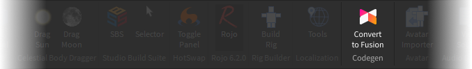
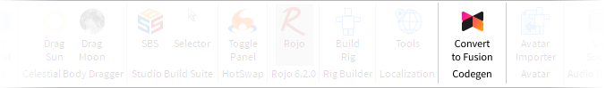
Here, this plugin is using the Fusion logo to represent a 'Convert to Fusion' action. This is fine, because users will understand the Fusion logo represents the thing being converted to.
However, be careful, as free-standing uses of the Fusion icon like this can easily become confusing. Make sure people understand the logo represents Fusion, and not the plugin, so confusion between the two is minimised.